This article shares some of my most satisfying “ah-hah!” moments learning CSS, and I hope it can prompt some “ah-hah!” moments for you too.
CSS is a unique language. At first glance, it can seem very simple. But certain effects that look simple in theory are often a little less obvious in practice.
In this article, I’ll share several useful tips and tricks that represent key developments in my own journey learning CSS. This article isn’t about demonstrating how complex CSS can get. Rather, it shares several useful tricks that you’re unlikely to find in most CSS tutorials.
If you’ve got any CSS tips of your own, I’d love if you shared them in the comments!
This very common requirement can be a puzzle for beginners.
For the most projects, you’ll want a footer that stays at the bottom of the screen, regardless of the size of the content — if the page’s content goes past the view-port, the footer should adapt.
Before CSS3, it was very difficult to achieve this effect without knowing the exact height of your footer. And, although we call it a sticky footer, you can’t simply solve this with position: sticky , because that can block content.
Today, the most compatible solution is to use Flexbox. The key is to use the less well-known flex-grow property on the div containing the main content of the page; in the example below, I’m using the main tag.
flex-grow controls how much a flex item fills its container, relative to other flex elements. With a value of 0, it won’t grow at all, and so we need to set it to 1 or more. In the example below, I’ve used the shorthand property flex: auto , which sets flex-grow to 1 by default.
To prevent any unwanted behaviour, we can also add flex-shrink: 0 to the footer tag. flex-shrink is effectively the opposite of the flex-grow property, controlling the amount a flex element shrinks to fit into its container, and setting it to 0 will prevent the footer from shrinking at all — ensuring that it retains its dimensions.
Update: Duc Hong suggested in the comments that the above solution may not work correctly in Internet Explorer 11. I tested my code in IE11 and it seemed to work fine. However, if you run into any compatibility issues, I would recommend trying out his solution.
2. Zoom-on-Hover Images
The zoom-on-hover effect is a great way to draw attention to a clickable image. When a user hovers over it, the image scales up slightly, but its dimensions remain the same.
To achieve this effect, we need a wrapper div to go around our normal img tag in the HTML.
To make this effect work, you need to set the width and height of the parent element, and make sure overflow is set to hidden . Then you can apply any kind of transform animations to the inner image.
3. Instant Night Mode
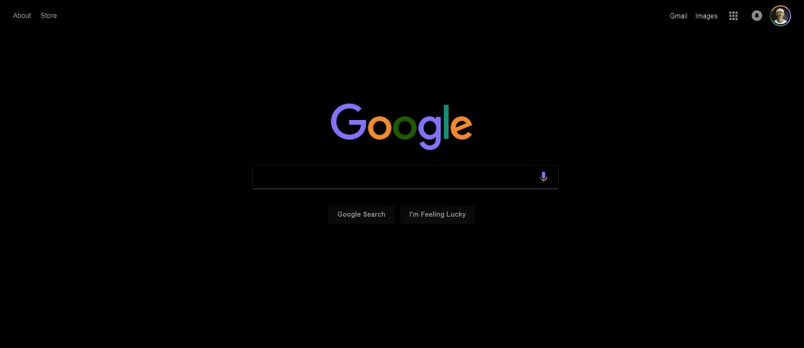
If you are looking for a quick way to apply a “night mode” skin to your website, try using the invert and hue-rotate filters.
filter: invert() is on a scale from 0 to 1 — where 1 changes white to black.
filter: hue-rotate() alters the color-content of your elements in such a way that they more-or-less retain the same level of separation from one another. Its values range from 0deg to 360deg.
By combining these effects on the body tag, you can quickly trial a dark version of your site. (Note that, to affect the background, you must give it a colour.)
Here’s an example:
body {
    background: #FFF;
    filter: invert(1) hue-rotate(210deg);
}
Using these settings, we can give Google’s homepage an instant makeover:
In Chrome or Firefox, press F12 to open up the Developer Tools. From there, you can edit any website’s CSS.
4. Custom Bullet Points
To create custom bullet points for an unordered list, you can use the content property, together with the ::before pseudo-element.
In the CSS below, I’m using two classes .complete and .incomplete to distinguish two different types of bullet point.
ul {
  list-style: none;
}
ul.complete li::before {
  content: '🗹 '; }
ul.incomplete li::before {
  content: '☐ ';; }
Bonus Use: Navigation Breadcrumbs
There are many more useful ways to take advantage of the content property, and I couldn’t resist adding one more.
Since the slashes and other symbols used to separate breadcrumbs are stylistic, it makes a lot of sense to define them in CSS. Like many of the examples in this article, this effect relies on a pseudo-class — last-child — only made available in CSS3:
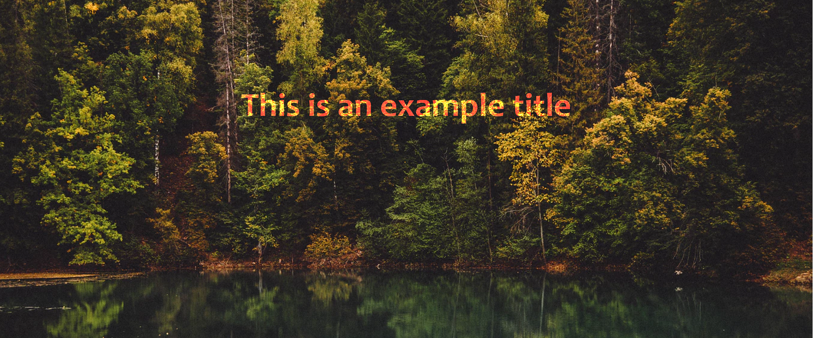
This eye-catching effect is increasingly popular, and it can be used to bring life to a page as the user scrolls through it.
While normal images of a page move as the user scrolls, the parallax image appears to stays fixed — only the window through which it is visible moves.
CSS-only Example
The must-have property for this effect is background-attachment: fixed , which fixes the background image’s position within the view-port. (The opposite effect is achieved using background-attachment: scroll ).
CSS + JavaScript Example
For a more advanced effect, you can use JavaScript to add movement to the image as the user scrolls. Credit to Renan Breno, for this CodePen, which demonstrates some of what’s possible:
6. Animation with Cropped Images
Like the sticky footer, it was very tricky to crop images before CSS3. Now, we have two properties which make cropping easy, object-fit and object-position, which together allow you to change an image’s dimensions without affecting it’s aspect ratio.
Before, it was always possible to crop your images in a photo editor, but a big advantage of cropping them in a browser is the ability to resize images as part of an animation.
To demonstrate this effect as simply as possible, the following example triggers the effect using an <input type="checkbox"> tag. That way, we can take advantage of CSS’s :checked pseudo-class, and we won’t need to use any JavaScript:
7. Blend Modes
If you’ve got experience using Photoshop, you likely know how powerful its different blend modes can be to create interesting effects. But did you know that most of Photoshop’s blend modes are also available in CSS?
Here’s what Medium’s homepage looks like when the images are given a background-color of lightblue, and a blend-mode of difference :
Plus, backgrounds aren’t the only way you can take advantage of blend modes. The mix-blend-mode property allows you to blend elements with their existing background. So, for example, you can create effects like this, with uses a mix-blend-mode of color-dodge and a background of lightsalmon .
Before CSS3, it was hard to believe that websites could look like this!
Note: there is currently a bug with Chrome 58+ where mix-blend-mode won’t render on elements set on transparent <body> or <html> tags. A quick fix is to give them both these tags a background-color of white .
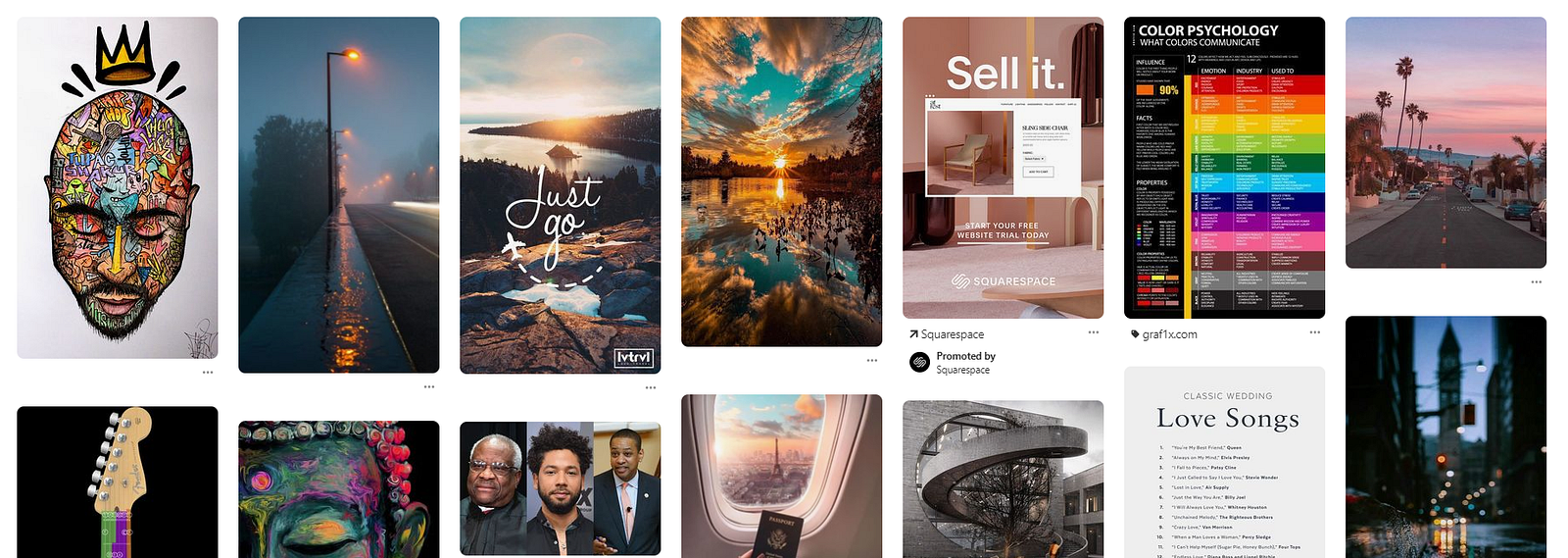
8. Pinterest-style Image Board
CSS Grid and Flexbox have made it much easier to achieve many different types of responsive layouts, and allow us to easily centre elements vertically on a page — which was very difficult before.
However, one style of layout they are not well suited to is the one used by Pinterest, where the vertical positioning of each element changes based on the height of the element above it.
https://www.pinterest.co.uk/
The best way to achieve this is to use CSS’s suite of column properties. These are most commonly used to create multiple newspaper-style columns of text, but this is another great use-case.
For this to work, you need to wrap your elements in a div and give this wrapper a column-width and column-gap property.
Then, to prevent any elements being split between two columns, add column-break-inside: avoid to the individual elements.
I owe my understanding of this effect to the following CodePen, by Dudley Storey, which demonstrates it very effectively.
The above example is also a great example of CSS’s :not() pseudo-class. He uses it with :hover , so that all but the hovered element fade out.
Additional Resources
Overall, I hope the following examples have clarified some useful CSS effects — and maybe even drew attention to a few features you weren’t aware of.
It was difficult to decide on my top 8 CSS tricks, since there have been several other CSS effects that really enhanced my understanding of it. These include features like animation using keyframes, scroll-snapping, more complex navigation bars, 3D effects, CSS for printing.
Features like these don’t really fall into the category of “simple tricks”, and they can be explored in considerable depth by themselves. so instead of describing them here, I’ll direct you to some of my favourite resources to learn about them:
If you have any CSS tips and tricks of your own, feel free to share them in the comments!
Thanks to Konstantin Rouda for his useful clarification about <em class="markup--em markup--p-em">flex-grow</em> and <em class="markup--em markup--p-em">flex-shrink</em> .
This website uses cookies to improve your experience. We'll assume you're ok with this, but you can opt-out if you wish.AcceptRead More
Privacy & Cookies Policy
Privacy Overview
This website uses cookies to improve your experience while you navigate through the website. Out of these, the cookies that are categorized as necessary are stored on your browser as they are essential for the working of basic functionalities of the website. We also use third-party cookies that help us analyze and understand how you use this website. These cookies will be stored in your browser only with your consent. You also have the option to opt-out of these cookies. But opting out of some of these cookies may affect your browsing experience.
Necessary cookies are absolutely essential for the website to function properly. This category only includes cookies that ensures basic functionalities and security features of the website. These cookies do not store any personal information.
Any cookies that may not be particularly necessary for the website to function and is used specifically to collect user personal data via analytics, ads, other embedded contents are termed as non-necessary cookies. It is mandatory to procure user consent prior to running these cookies on your website.